

2024 art diary #2 ★ that ‘70s show & rollerwave with a twist?
TODAY’S MIXTAPE:
TODA'Y’S PROMPT: CALL
IDEA, INSPIRATION & A PEEK INTO MY SKETCHES
I started this illustration sparked by this scene from That '70s Show.

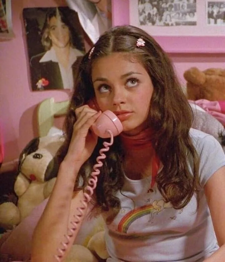
Even tho I haven’t watched the whole series, I’ve always been drawn by the rollerwave aesthetic and that specific “70s look” from movies — a mix of vibrant colors, soft pastels and a dash of retro-futurism that feels dreamy and surreal. While my usual style leans more towards a pop-punkish 90s-2000s vibe, I wanted to see if I could convey this whimsical and offbeat ‘70s aesthetic into my art.
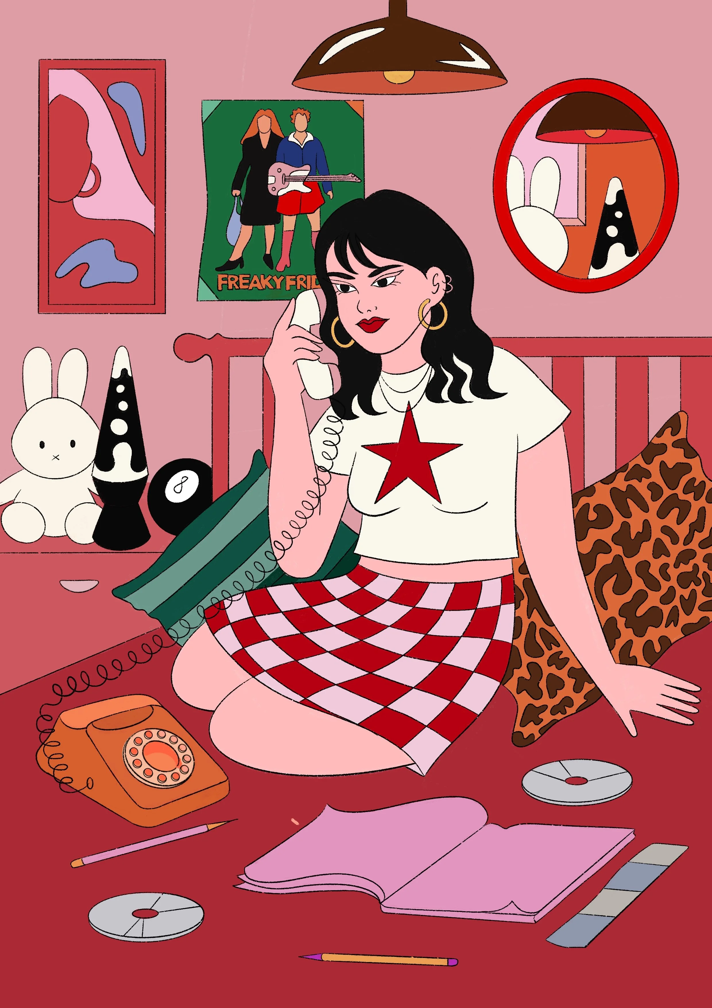
So these are some of the initial sketches & I can’t say I strayed too much from the scene in the show. It wasn’t that hard for me to dive in into the atmosphere because it fits very good with what I usually draw: girls in cute, slightly chaotic bedrooms full with charm and fun objects that tell a story. I pulled elements from the set but added in a bunch of my signature pieces to really make it mine. You’ll spot things like posters, framed pictures, pillows and quirky toys scattered around. There’s always a lava lamp glowing in the corner, along with stacks of magazines, diaries, and those nostalgic old CDs that give everything a retro, lived-in feel. It’s a combination of dreamy clutter, nostalgia, and a cozy sense of whimsy — just the kind of atmosphere I love to bring to life in my work. These little details were a lot of fun to sketch xx


PROCESS AND COLOR PARTY
When it came to picking the color palette for this piece, let’s just say I went on a bit of a journey. In my last illustration from this series I kinda knew exactly what tones I wanted from the start, but this time I went all in with experimenting. Initially I thought I’d go heavy on the pinks and pastel purples (staying true to the original scene), but then I decided to warm things up with a bold orange instead, which I think brought a cozy and comfy vibe to the whole composition. And it just felt right. Did I maybe overdo the orange a bit? Probably. Do I regret it? Nope. It totally fits the mood and I love how it turned out.
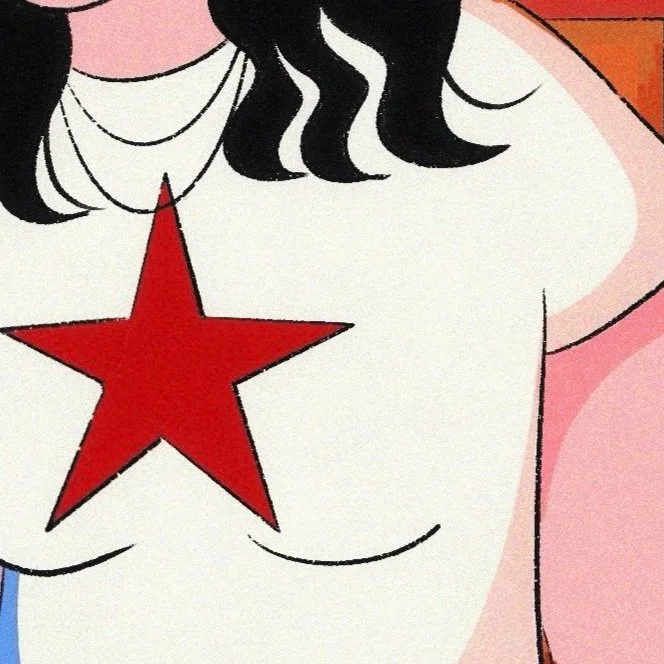
As for the character’s outfit — let’s just say I got a little carried away (in the best way). I think the girl in the original scene was in her pajamas, but I couldn’t resist putting my own spin on her look and what started as sleepwear ended up as a full-on rockstar-inspired lookbook that’s way more in line with my style. I gave her a checkerboard skirt and a tee with a star on it, totally channeling that edgy, cool vibe I love to draw (rip to cosy, welcome to punk).


SHADOW PLAY & NEW ART PERSONALITY TRAIT UNLOCKED
Next up: adding the shadows. Like I said in my previous post, I’m still working on mastering this part and I always try and experiment with something new. That being said, besides the orange tones and the pastel pink, I had this idea of adding some blue shades and well well well, consider it a new art personality trait because I’m officially obsessed! I think this blue tone gave the whole piece a neon-like glow and it brings out subtle details that might’ve been overlooked otherwise - making the illustration really pop in a whole new way.
I’m pretty sure this recipe is sticking around for future illustrations too, because it just works!! What can I say, shadows have never felt so fun, lol x


ADDING TEXTURES
For this illustration I decided to keep things surprisingly simple when it comes to texturing. Instead of layering on the usual array of textures, I opted for the classic soft grain with a touch of glow. I think the glowing effect works very well for certain elements, like the tee and the miffy toy which have that white-yellowish color that comes to life when adding in texture.
I also sneaked in a super subtle a spray paint texture you might not catch if you don’t zoom in… Or I’m not wearing my glasses enough? Idk. Either way, it adds an extra layer of fun to the piece xx


AND THERE SHE GOES <3
LIL DETAILS & FINAL PIECE
Here’s the final piece and I gotta say I absolutely LOVE sneaking in subtle details in my illustrations which you only catch if you zoom in. For this piece, I couldn’t resist adding a poster featuring one of my fav movies from my teenage era, Freaky Friday. Plus, there’s an old CD labeled “girly music” bc I can totally picture the girl in the illustration blasting it on her boombox while dancing around her room. And of course, I had to throw in another CD that says “Gossip Girl: All Complete 6 Seasons”, because yes xx
As you can see, the final illustration has drifted a bit from the original inspo pic and even from the whole rollerwave concept, but isn’t that the purpose of art? I personally loved how it turned out and I really enjoyed the process of experimenting & allowing my style to shine through instead of just replicating the initial idea. I hope you enjoy it too, especially the close-ups <3 xoxo


