2024 art diary #5 ★ sunday night sleepover
TODAY’S MIXTAPE:
TODAY’S PROMPT: COSY
IDEA & SKETCHES
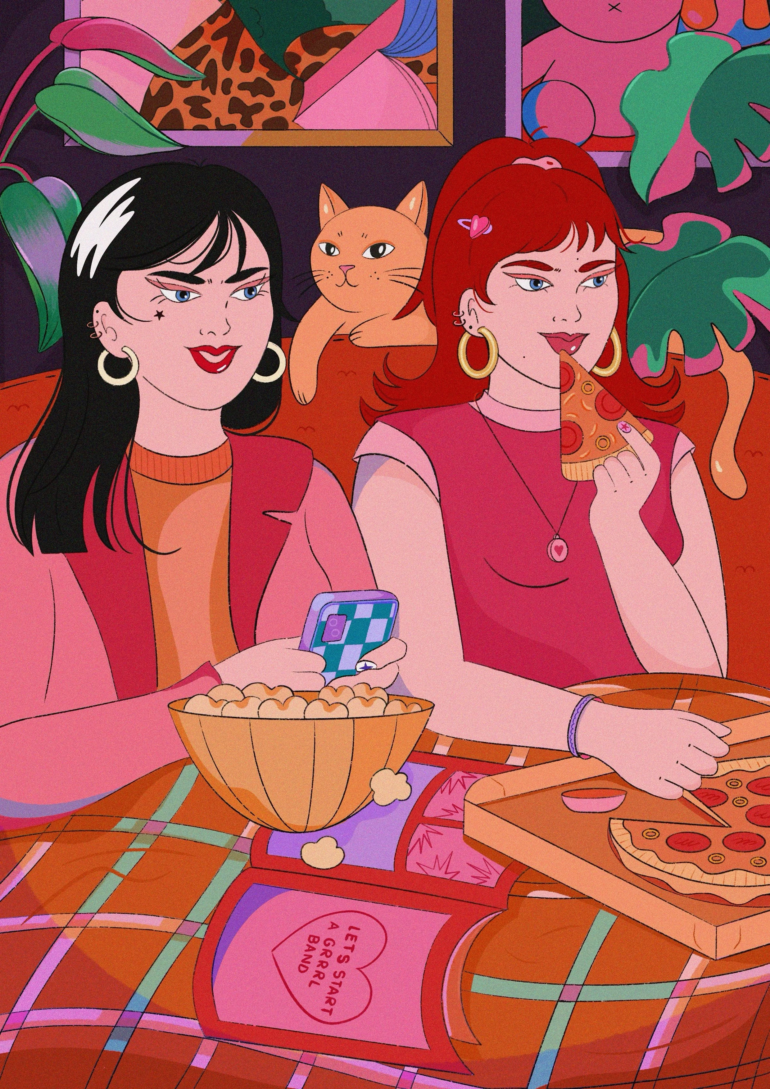
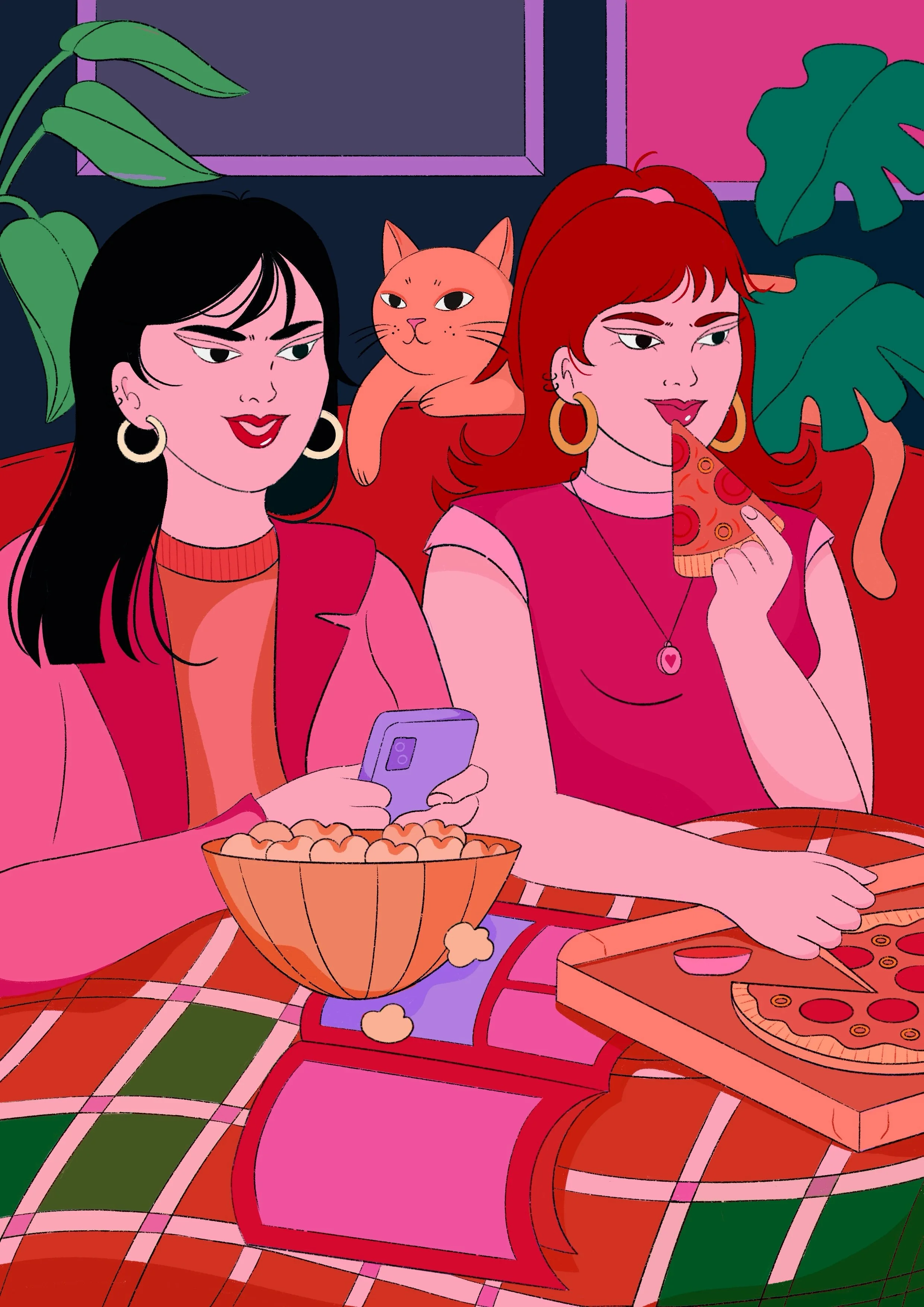
For today’s prompt I just had to sketch my favorite subject in the world: bff duos! <3
There’s something so special about capturing the bond between two people who just get each other, honestly the most sacred thing to me. When I saw the word “cosy,” my mind instantly jumped to one of my favorite moments I share with my bestie: our classic movie nights. You know, the kind where you rewatch your favorite cheesy shows for the millionth time, laugh at all the same parts and somehow still get emotional at the predictable endings. Throw in a mountain of pizza boxes, a ridiculous spread of salty snacks and the comfiest sweatpants & you’ve got the perfect scene.
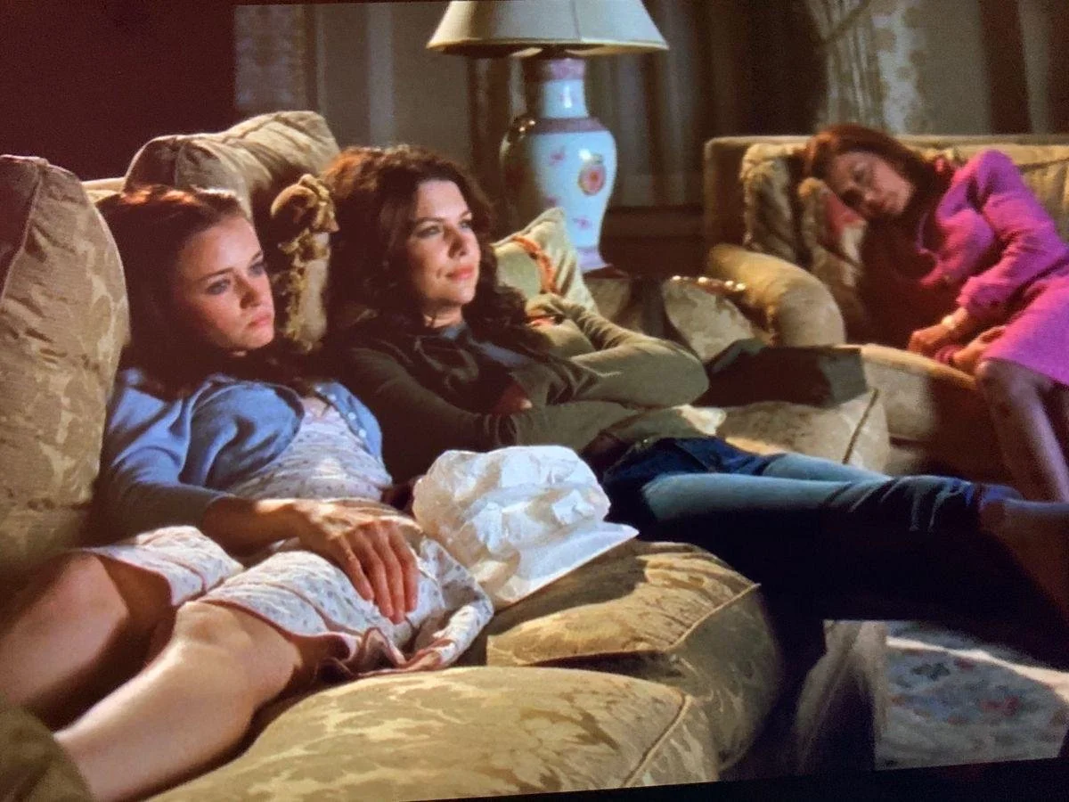
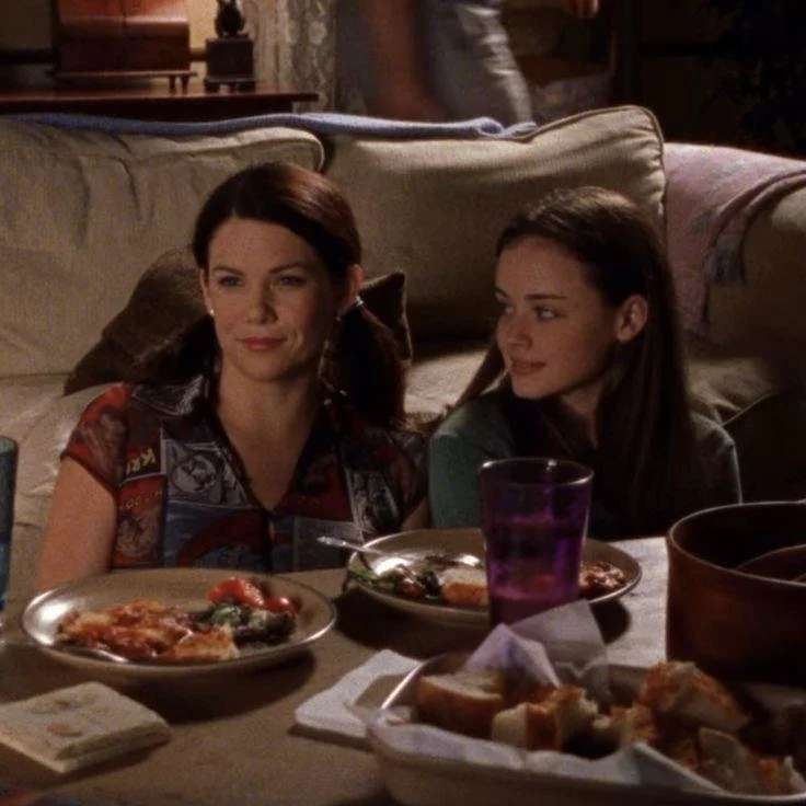
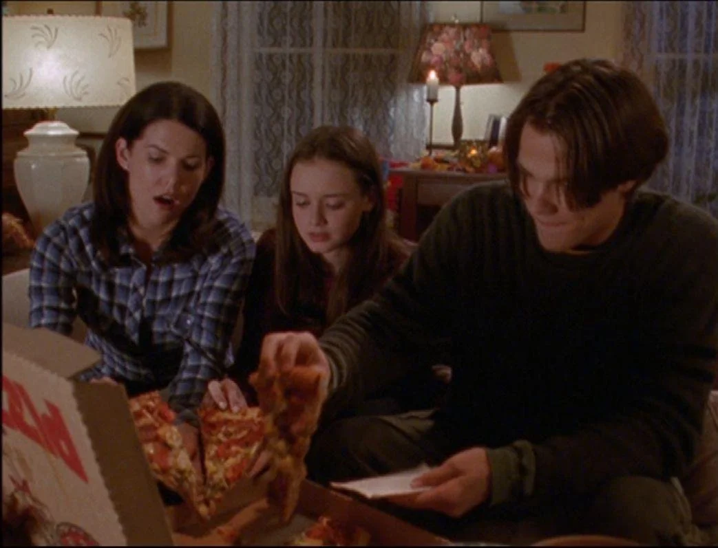
This vibe also reminds me of the iconic Gilmore Girls episodes where Lorelai and Rory have their movie marathons, piling up junk food, grabbing all the blankets and settling in for hours of uninterrupted tv time — the exact energy I want to capture in this piece too.
If you haven’t seen the show, I got some snapshots for u (and u totally should watch it btw):

Having all of this in mind, plus the fact that this is my first official illustration featuring a besties duo, I was ridiculously excited to dive into the sketching process. Here are the first and final draft and some detail closeups.
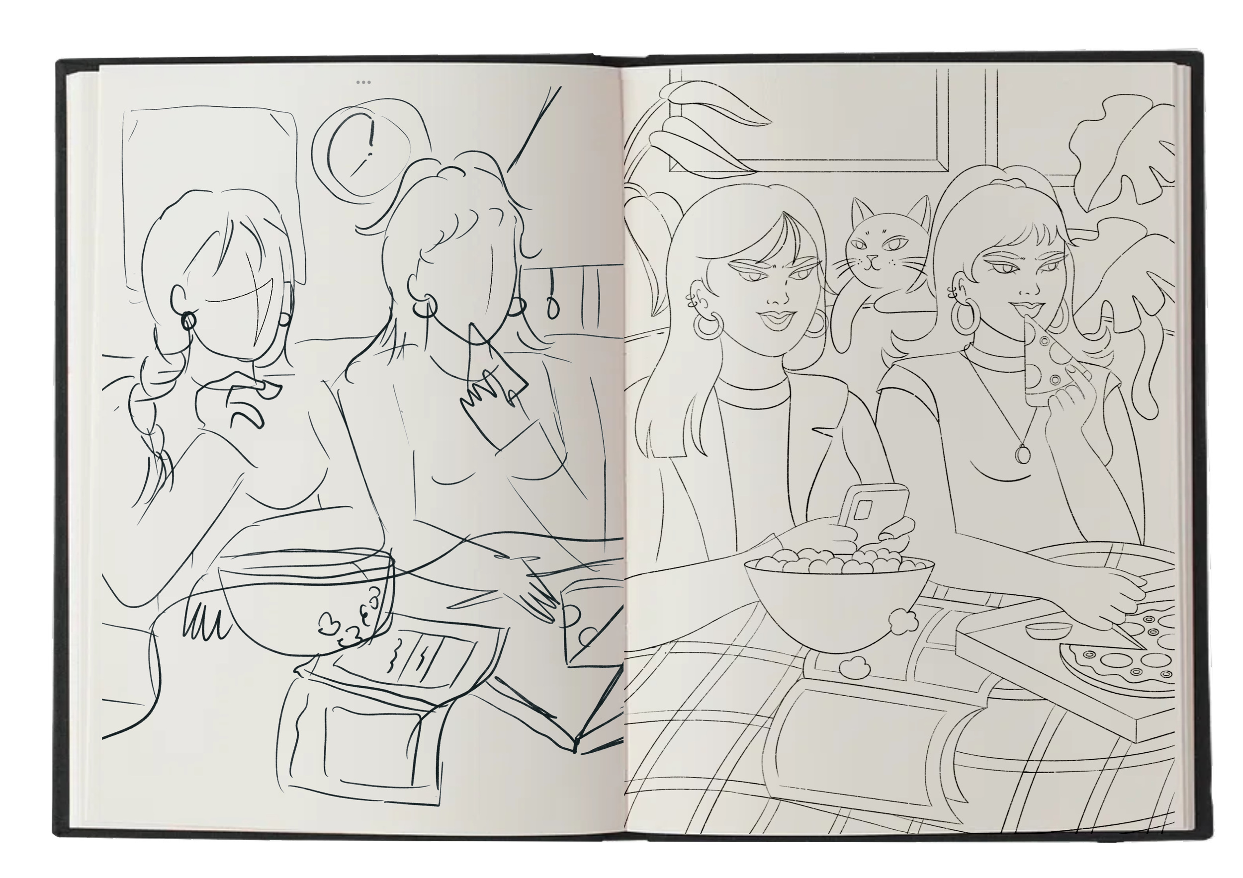
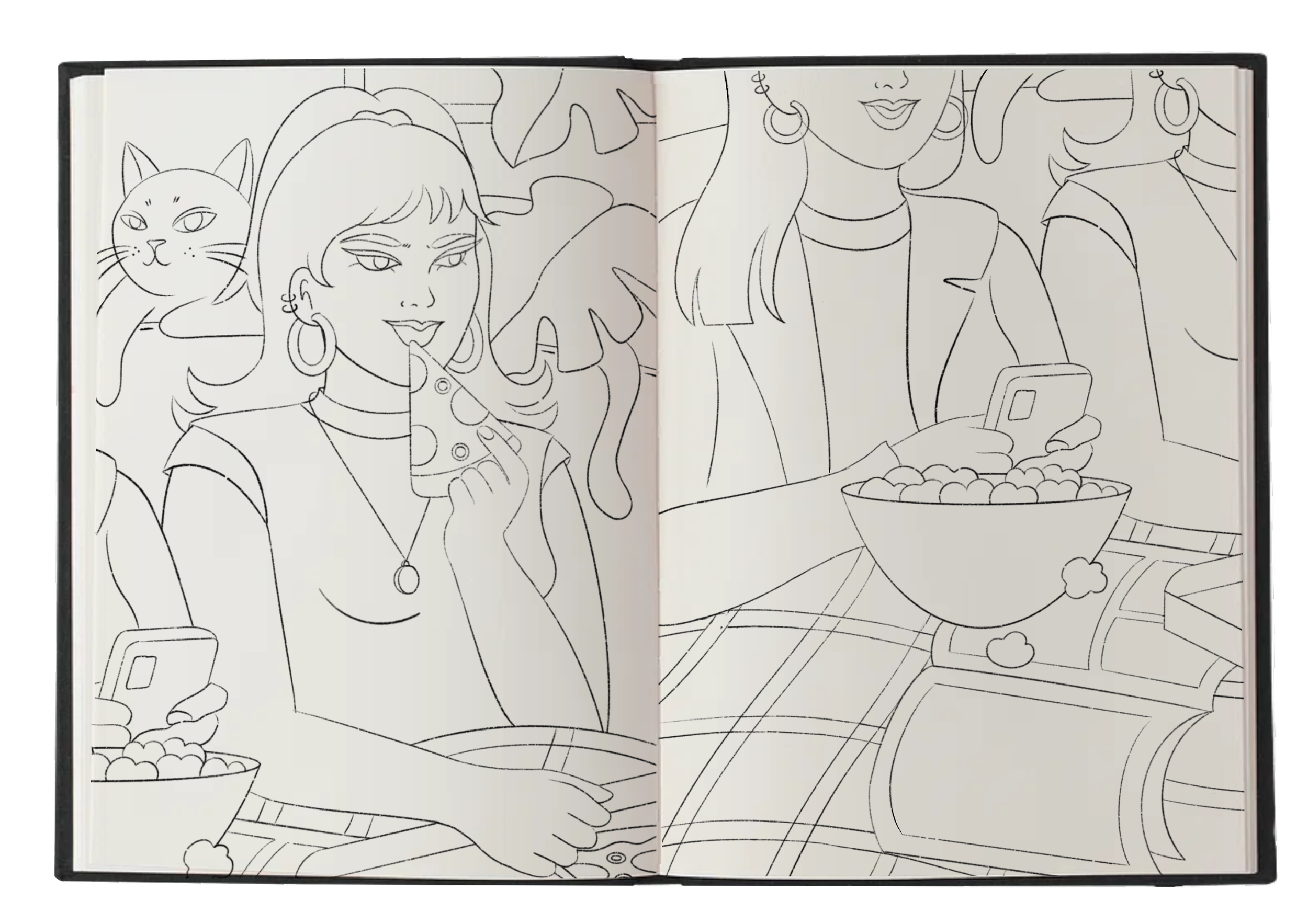
I think I sketched the characters on the sofa in just a matter of minutes, but when it came to the background, I had no idea what would work best. I kept going back and forth, trying different ideas to see what clicked.
At first I added a lamp and some paintings on the wall which looked cute, but felt a little too plain. Then I switched them out for a big window with a gorgeous sunset which was definitely a pretty idea, but yet again, it didn’t exactly fit the cozy “movie night” vibe I was going for. After playing around with a few more options, I finally decided to keep it simple and let the focus stay on the characters. I went with some plants, a couple of paintings on the wall and obviously, a cat. <3
The final sketch is literally an exact replica of how my cat sits whenever I’m watching tv with my friends, so I’d say my movie nights are obviously better than the ones in Gilmore Girls, haha.
COLOR PALETTE
For this illustration I didn’t really feel like experimenting too much with the color palette & had a pretty clear vision in mind from the start: I wanted to focus on pink tones instead of leaning into oranges like I did in previous illustrations, so I played around with different variations of a pink-ish palette until I stuck with one I liked the most.
I normally choose to make certain elements stand out in my illustrations, whether it’s the clothing, accessories or decor, but for this piece I wanted to take a different approach and create a more cohesive vibe, where everything blends together. To achieve that cinematic scene, I worked with just three main colors (red, purple, and pink) and used slightly different shades from each to tie everything together.


SHADOWS, HIGHLIGHTS, GRADIENTS (before & after)
To keep that same iridescent, slightly whimsical vibe where the lighting is low but still feels warm and cozy, I decided to experiment a bit with my usual shadowing technique.
I decided to mix some purple & pink to get a gradient effect over the poppy green of the plants and seeing how pretty that corner turned out, I wanted to make it symmetrical by incorporating green highlights into other areas, like the clothing and blanket. This technique is actually something I’ve tried before in past illustrations, but on this one I think I managed to get more of a glowing effect, almost like the light from the TV screen is reflecting off various parts of the scene.
I’m pretty happy with how this stage turned out, but I think there’s still a lot of room for improvement in the shadowing technique department.


DETAILS & EASTER EGGS
As you’ve probably noticed by now, I love sneaking in subtle details and clever nods in every illustration I make, whether it’s a pop culture reference, a little something about me, a favorite quote or just a symbol that makes you think of something. So in this piece I included two of my previous illustrations as paintings on the wall in the background, which I think fit perfectly with the overall vibe. I love the idea of weaving my art into my art, kinda like a little easter egg.
I also tucked in a colorful checkerboard phone case I actually own in real life, plus a hidden message on the magazine with the phrase "let’s start a girl band" — a text which actually popped up in my works a lot over the years & at this point I’m just putting it out there wherever I can, like my own little manifestation (or invitation), haha.
Plus, I added a bunch of cute, girly accessories to give the characters more personality. The girl with the red hair is always dressed a little fancier, with her hair up and shiny, while the brunette girly is more casual with her sparkly loose hair. It’s all of these little touches that make my illos feel more alive to me.


TEXTURES & GRADIENT MAP
I kept the textures pretty light because I felt like the shadowing and highlights already gave it enough depth, but I couldn’t resist making it a little more dynamic, so I added the classic grain effect, played around with gradient maps and tried on an old lightroom filter. I don’t think the difference is that huge and somehow I ended up with more orange tones than expected (at this point, I guess orange it’s just a guilty pleasure), but still, I think the final version has a very polished look that feels just right.


AND THERE SHE GOES <3
FINAL PIECE & CLOSEUPS