

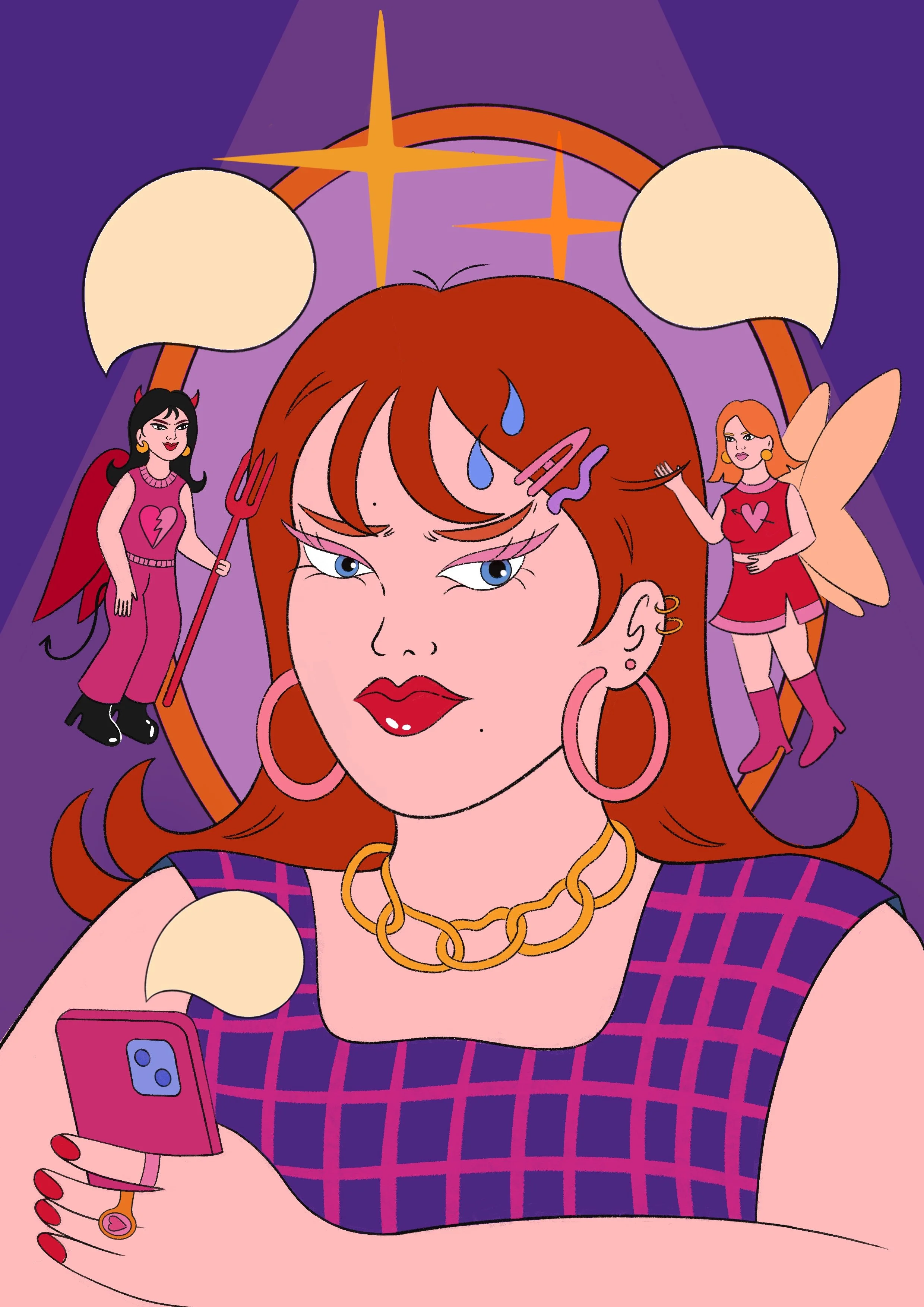
2024 art diary #12 ★ good fairy, bad fairy??
TODAY’S MIXTAPE:
TODAY’S PROMPT: PIXIES
IDEA & FIRST SKETCHES
When I started thinking about this prompt, I honestly felt a bit uninspired. I didn’t want to do something overly fantasy or recreate a childhood story, but more like drawing something in my usual approach, with fun twists and those little girlhood references I love adding. Then I remembered a concept I really loved as a kid, one I saw in many cartoons and shows: the “shoulder fairies” trope, where a tiny angel and devil appear on someone’s shoulders, each trying to push them toward a good or bad decision.
The second I thought of that, I knew what I wanted to draw: a girl sitting with her phone in her hand, trying to decide whether to text her ex back. And ofc it had to include two pixies and text bubbles, so that’s how another one-page comic illustration came to life.
I started sketching the setting, the characters and some of the elements I wanted to include.


CHILDHOOD CARTOONS INSPIRATION (SHOULDER FAIRIES TROPE)
Here are some snapshots from old cartoons featuring the classic “shoulder fairies” concept & honestly, I can’t get enough of it. I’ve always loved these kinds of episodes and thought they’re so funny. I’m glad the idea stuck in my memory and I associated it with the prompt xx
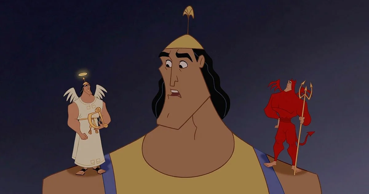
Out of all of these, the one I remember best (and love the most) is the scene from Daria, a cartoon that influenced my style so much and was one of my absolute favorites growing up. I vaguely remember the other two, but I know for sure that the last snapshot is from Arthur, though I don’t really remember the exact scene (even tho if I’m a proud Minimax kid, oops).
Also, I swear I’ve seen this concept pop up in movies and tv shows too, so I’ll definitely track down more examples and update this series of pictures.


COLOR PALETTE & BACKGROUND VARIATIONS
When it came to choosing the color palette, everything seemed to fall into place effortlessly, there wasn’t much experimenting needed.
Out of the four versions I fist considered the one that stood out with a completely different background: a room that subtly nods to a previous illustration of mine called ‘Cocktail’, which I thought would be a clever little reference.
Even tho I loved the warm tones and overall comic-like vibe of it, in the end I chose the version that felt better: the one where the fairies truly pop !! That version has a whimsical, cartoony and almost surreal vibe that instantly reminds me of scenes from The Fairly OddParents, a silly cartoon I used to watch in middle school whose playful energy stuck with me. I opted for a simpler approach with sparks and a mirror in the background, a refreshing shift from the intricate objects and rich decor I usually draw, leaning into the fun, silly side of things instead.


BESTIES TRIO?
If you thought my classic bestie duos were iconic, get ready, because the squad is expanding: enter the dynamic trio <3
The vibe here might be "good fairy vs bad fairy," but at the end of the day, they’re just girls doing what girls do best: having fun, causing a little chaos & sticking together, haha.
This illustration was such a blast to work on, and I see endless possibilities with this concept, so I have a feeling these three are going to make a lot more appearances in the future. Picture it: these girlies arguing over outfit choices, debating sappy rom-coms with a tub of ice cream vs popcorn-fueled horror movie marathons, deciding on makeup looks for a night out or dishing out relationship advices. Girlhood, always.


ADDING TEXT (ONE PAGE COMIC COMEBACK)
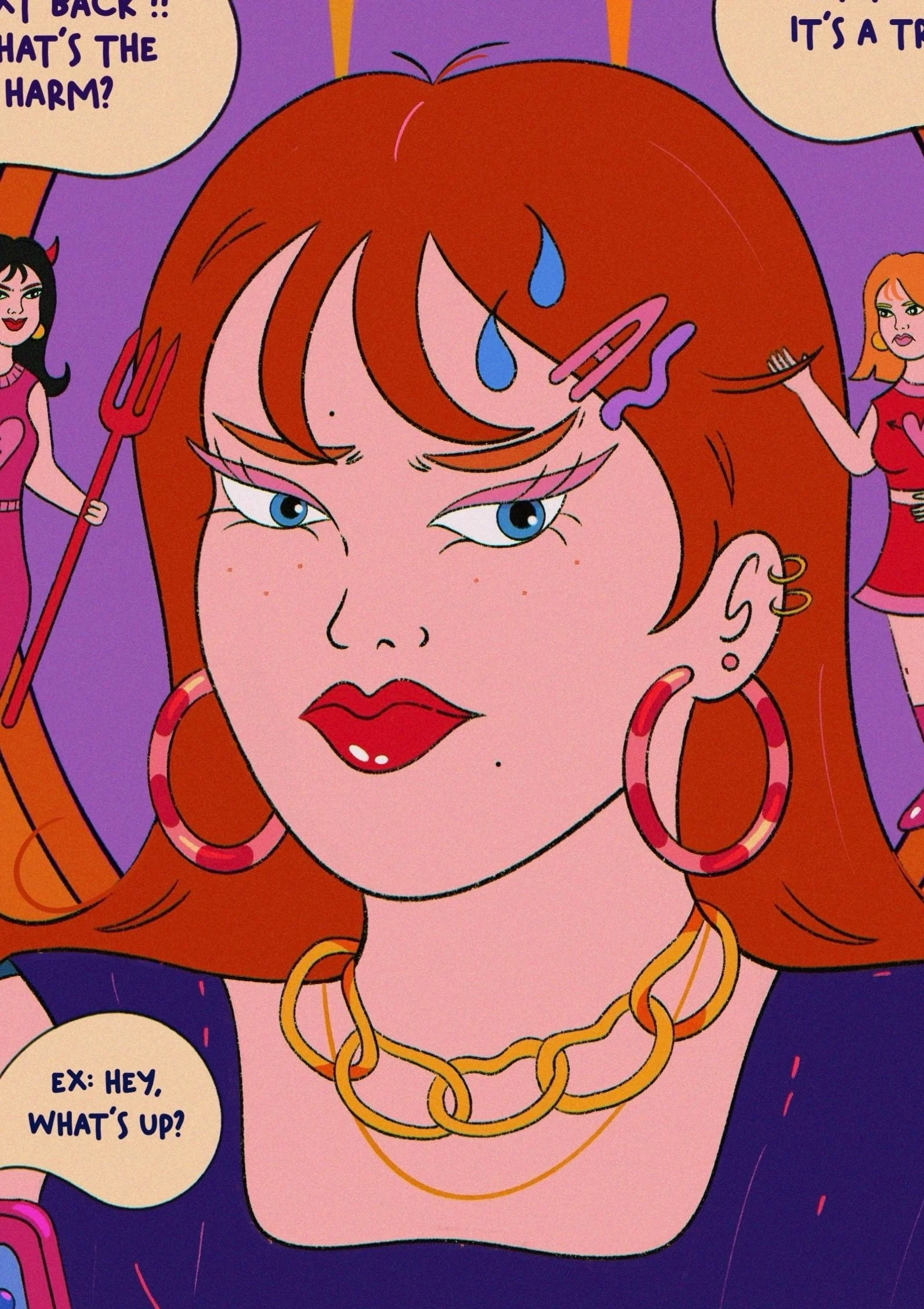
Adding text to this illustration felt like the natural thing to do (as the good and bad fairies had to weigh in on girlie’s decision), so I included three text bubbles: one for the phone and two for the fairies, carefully linking them to flow well both on their own and as a conversation.
I drew inspiration from how I text with my friends: playful, silly, fun and undeniably chronically online. Honestly, it brought so much personality to the piece and made the dynamic between the characters even more relatable. It was such a fun touch to add, and I think it really ties everything together <3


TEXTURES
As I mentioned in the blog post for my last one-page comic, I’m still playing around to find the perfect shading and texturing “recipe” for these pieces. I want something that captures that classic comic-book vibe while still keeping the illustrative richness and detailed touches I love.
For this piece, I stuck with my usual go-to methods: a grain effect paired with subtle chromatic aberration and a hint of gradient mapping to pull everything together. The new twist here is the subtle undertone created by the low lighting, which gives the illo a slightly moodier vibe while keeping those bold, blended, and vibrant colors intact.
Even though I’m excited to keep experimenting with techniques for this style, I’m genuinely so happy with how this one came together <3


AND THERE IT GOES <3
FINAL PIECE & CLOSEUPS


