

2024 art diary #8 ★ monday night cocktail with bestie? sign me in asap xx
TODAY’S MIXTAPE:
TODAY’S PROMPT: COCKTAIL
IDEA & SKETCHES
My initial idea for this illustration was to draw a hand holding a fancy cocktail glass and finally do something zoomed in, focusing on a simple object to see how I could make it detailed and eclectic.
Was it a nice idea? Sure. Did I end up scrapping it to create another besties duo illustration? Yup. Do I regret it? Nope x
That being said, here are my sketches for this illustration. As you can see, I had a bit of a struggle with choosing the background (as always, lol). I think the version with the disco ball and mirror could’ve been super fun, I can vision them all pastel-like and glittery, but I kept feeling this pull to make it a bit more moody. So finally I decided to blend the background a little and place the girls in a setting that feels more like a fancy pub.


REMAKE OF AN OLD ILLO
Before I dive into the process of this illo, I need to show you some old versions of it, since this was an old draft I decided to revisit for this prompt.
The first one is from 2023, and honestly? I think it looks a bit silly and it still has that simple, doodly vibe I’ve been trying to move away from.
But the second one? I can’t stress enough how much I love that illo. Made at the end of 2023, it holds a special place in my heart because it was the first piece I finished after a few months of just experimenting around. It feels like both an outgrown of my old style, but still not a drastic change that would make me feel disconnected with my visual approach.
To this day I’m actually kind of sad I didn’t experiment more with that entire aesthetic. I think I could’ve created some gorgeous pieces in that specific vibe, but now it’s too late cos I’m a too hooked on colors, haha. Who knows tho, maybe this black and white lookbook will make a comeback at some point.


FROM BLACK & WHITE TO MOODY RETRO COLORS?
Like I said, the black and white illo will always be special to me because it has this certain cohesion that really stands out, so when I had to add color to this new version, considering how attached I was to the old one, I’ll admit: it kind of felt like no matter what colors I chose, they wouldn’t blend as perfectly or match the same way. Turns out I was wrong and just being impatient, woop. After some experimenting, I can confidently say I found one of my favorite color palettes. It's this perfect mix of red, orange and pink, with dark blue which compliments it so nicely. It’s just sooo pleasing to look at !!
One thing I always aim to do in my illos is to convey a specific mood, not just slap together colors that look nice. There are times when I actually let go of certain shades that might look better individually, and instead choose tones that help create the exact mood I want. I did the same thing for this illo too and went with an overall dark candy vibe: a cozy, yet glamorous atmosphere where the girls are gossiping over cocktails, but there’s still a chill, laid-back vibe. I wanted to portray them sitting by a big window, imagining they’re listening to blues music on a record player placed in the corner, just having all kinds of conversations after a busy day. I think the colors really shape the mood I had in mind & while the black and white version had an upbeat, poppy, happy energy, the colored version feels more introspective and moody.

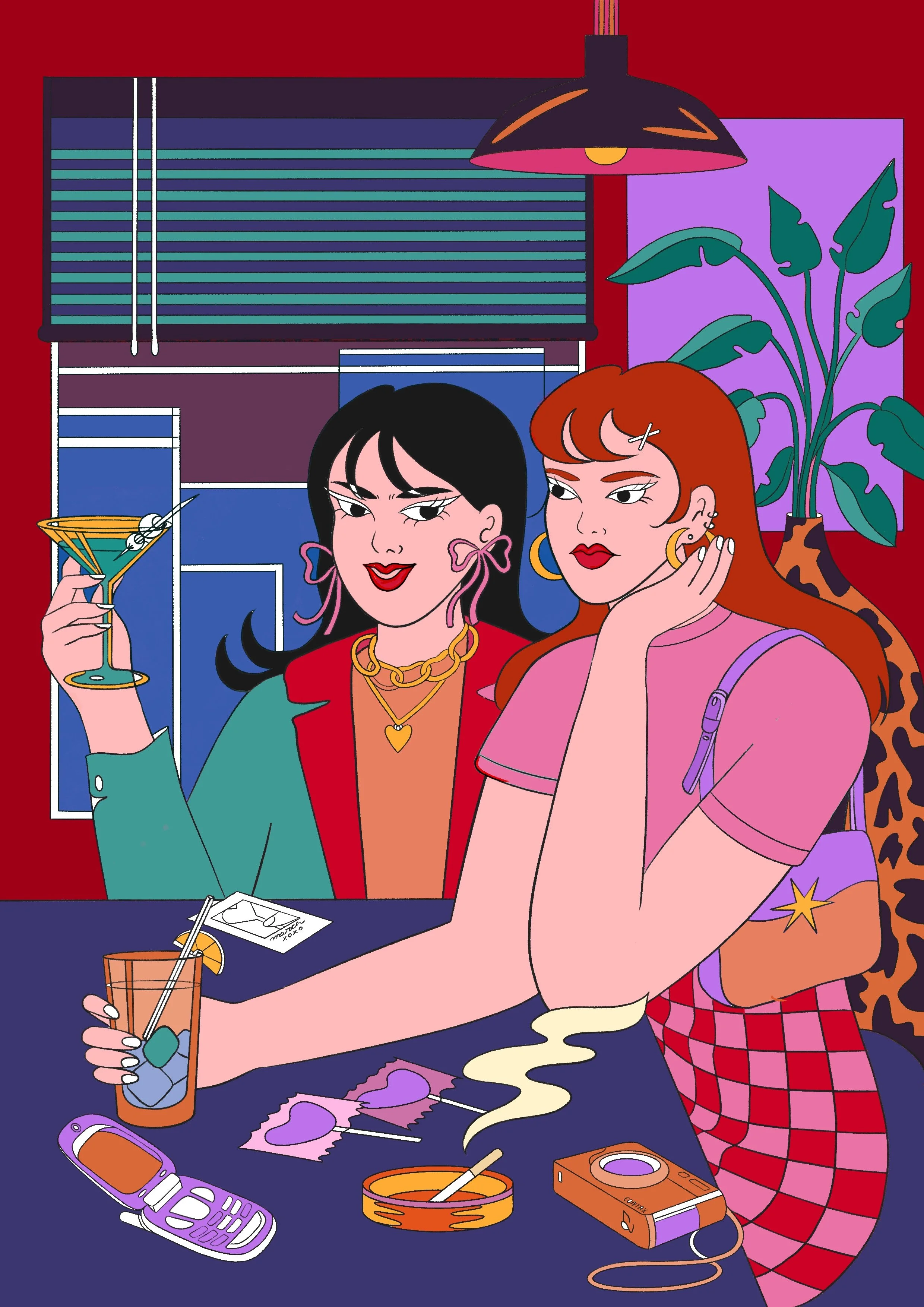

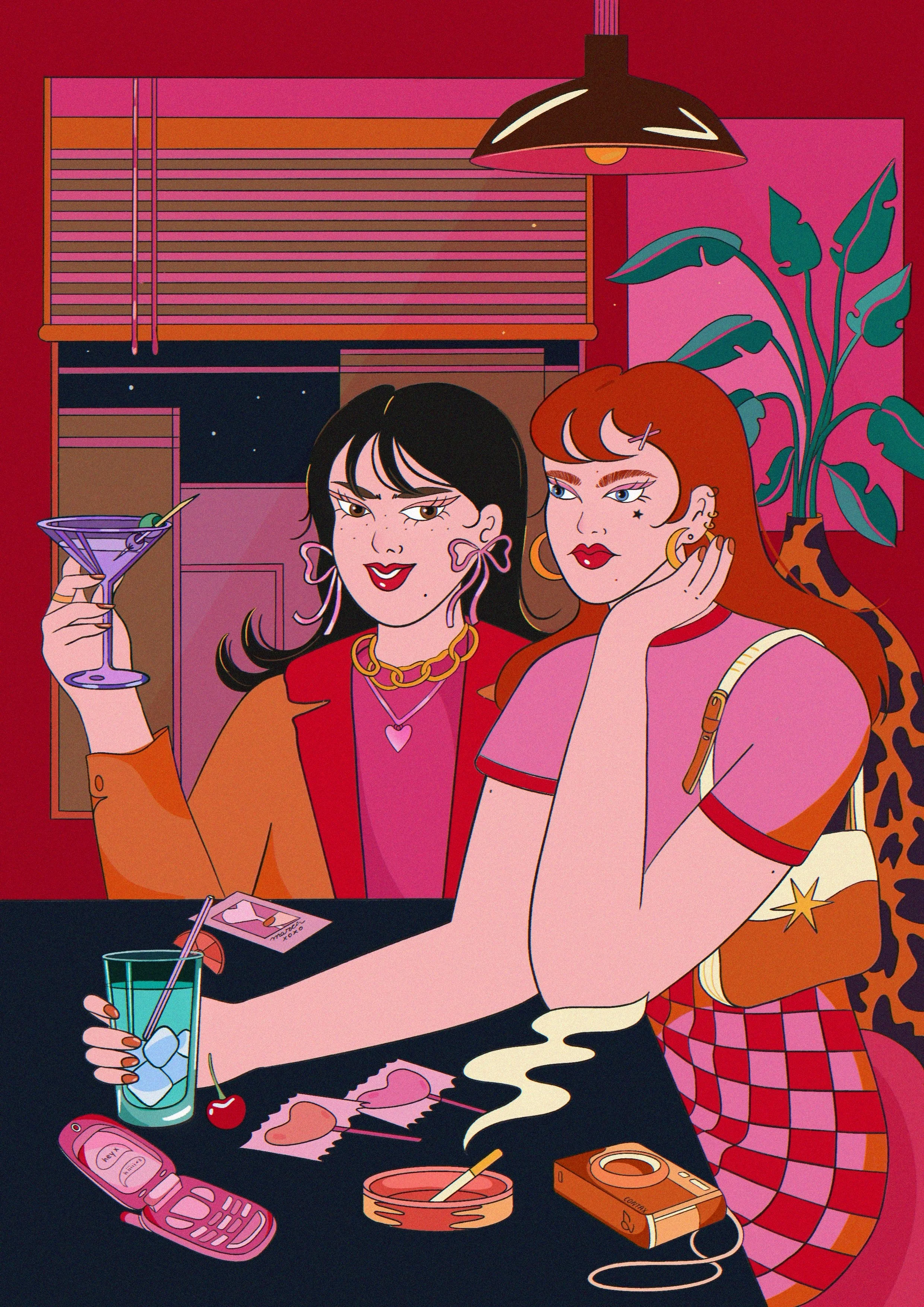
SIGNATURE ELEMENTS: RETRO-GIRLY ACCESSORIES & PATTERNS
I love a good classic illustration packed with lots of patterns and retro-girly accessories, so I decided to include a pink, girly flip phone which I’d love to own, some heart-shaped & fruity-flavored lollipops, cherries, a cute baguette bag I’d also love to own, a polaroid picture and a film camera. Then, to add a twist to the sweetness, I threw in a cigarette in an ashtray. Honestly, I just wanted an excuse to draw some smoke which I think looks so good in my illustrations.. that’s pretty much the only reason I include cigarettes in general, haha. Maybe I’ll swap them out for funky candles in the future? x


BASE COLORS VS SHADOWS & TEXTURES
Texturing wasn’t that complex or groundbreaking in this illustration, aside from the usual grain effect. I think what really elevates the piece are the little details I don’t always include, things like the stars out the window, freckles and hair highlights. I’m pretty proud of how I managed to add these subtle touches that give the illustration a special look which takes it beyond just the base colors. I really want to experiment more with skin and clothing characteristics, to make the characters feel more relatable. Like I mentioned before, these small additions are what make my illos feel alive to me <3


AND THERE IT GOES <3
FINAL PIECE & CLOSEUPS


